Decks that Intimidate Me – (non) VR to BoyDiviner

The BoyDiviner on YouTube did a video that, although it is not a hashtag, I really enjoyed a lot and decided to do a (non)VR to anyway.

This is about tarot decks that intimidate me in some way or another.  I don’t have many, but there are a few in my collection that fit the bill.  Here is an outline of what these decks are, and how I feel about them.

ST

Secret Tarot by Dominic Murphy

I absolutely love the artwork in this deck.  I love the concept, the originality, the expressiveness in the cards.  I love it.

But, at the same time?  I find it very intimidating.  I think a lot of that has to do with the fact that after the major arcana, the deck is an entirely different structure.  I’ve had more luck with the Lost Tarot by the same artist, as there seems to be a bit more structure in that one than this one.

Still, I keep it because I love the artwork.  And, at some point, I plan on doing a depth study of this deck to help me (hopefully) become more familiar and comfortable with it and its unusual system.

TH

Thoth Tarot by Aleister Crowley

I used to think that it was just the Thoth system that intimidated me, but after working with the Gill Tarot and a few others, I think in this case it’s the artwork, not the system.

Something in the artwork for the original Thoth deck just makes me want to ‘shield and retreat’ in much the same way that I feel when I come across someone radiating abusive vibes.   I bought this deck to delve deeper into the Thoth system, but every time I pick it up, it turns me off.   Not just emotionally or aesthetically, but even my intuition turns away from this deck and will refuse to speak.

WW

Wild Wood Tarot by Mark Ryan, John Matthews, and Will Worthington

I genuinely adore this deck and its earthiness, although I find the energy of this deck just a but too heavy.   I love the artwork especially.  But, for some reason I have a hard time reading this deck intuitively, and many of the cards do not follow the RWS system, so I then struggle with reading it logically as well.

I did a depth study on this deck for an entire year, but I still find myself unable to read with it confidently, even after a year of serious study.

DG

Dreams of Gaia Tarot by Ravynne Phelan

It’s the faces.   I mean, yes, it’s an entirely different system from any other deck out there, but I think I would be more inclined to learn that system IF it wasn’t for the FACES.  They just bug me for some reason.  I don’t like them.

That said, I do use this deck, but I use it as an intuitive oracle instead. Usually when harsh truths are required.

SPK

Spirit Keeper’s Tarot by Benebell Wen

This one is purely all about information overload.  I’m kind of wondering if this deck isn’t more suited to the logic-style of readers rather than the intuitive style?  I’m not entirely sure.   I just find there is SO MUCH information in each card that I feel overwhelmed by them when I try to read with them.

I think they’re amazing, and I think Benebell Wen (who drew each of these cards by hand) is brilliant.  I have the study books that go along with this deck and intend on doing a depth study with it at some point.  But, at the moment, I find it a bit too much and the cards make me feel like the crossed wires between my logic and intuition are about to blow a fuse.


A Moment of Realization with the Tarot

basic-elements-1663243

I’m pretty well seated in how I both see and use the tarot, and comfortable in that.   But, just recently I came to a new realization about how I see the tarot and its suits.

Up until just the last few days, I had always thought that I saw the suits as “cups, pentacles, wands, and swords”, regardless of the fact that those names don’t always just “roll off the tongue” for me (so to speak).

Then, I got the Numinous Tarot in the mail and it showed me that this isn’t how I view the suits at all, which is a little odd since I’ve had other decks that rename the suits, but it really stuck out to me with this one.

In the Numinous Tarot, the suits are renamed as vials, tomes, candles, and bells.  And, when trying to sort this out?   My mind never even -went- to the whole “cups, pentacles, wands, and swords” thing, but instead went immediately to the elements.

Yes, all along I’ve known and been intimately aware with the correlations between the suits and the elements.  Cups = Water, Pentacles = Earth, Wands = Fire, Swords = Air…. and yet, never before has it stuck out to me how -much- I see the suits not as their names at all, but the elements themselves and the qualities those elements represent.

I’d guess that I’ve been pairing the suit names to the elements so long that, for the most part, they became synonymous with each other.  And yet, clearly, they are not as when push comes to shove?  It’s not to the suit names I relate, but the elements they (for me) represent.


Top 5 Decks I Cant Live Without (non)VR To Kelly Bear

I feel like I’ve answered this recently, but I can’t find it.  It’s a bit different than Simon’s “five favorites” as you can pick from any decks you have.  Still, I looked through and couldn’t find it so maybe it’s something I did in my head instead of actually writing down.

2019Top5

This post’s theme was originally created by Kelly Bear on YouTube a few years ago, and she recently did an update (because, well, favorites change over time).  From what I understand she usually does an update to this list yearly for her, we’ll see if I can remember to update it next year.

The way that I’m looking at this question is along the premise of if my house was on fire and I could only choose FIVE decks out of my collection to save, and none of my collection could be replaced for some reason, what five would I grab?

So here are my top five decks that I would  not want to live with out… at this moment.

Tarot of the Hidden Realm – This goes without saying. I’ve mentioned this many times on here that when I opened the box I had a very deep and immediate reaction to these cards the moment I touched them.  They speak to me on a level I’ve never had another deck speak to me before and I can’t see these cards falling off of this list any time soon.

Although… the artist is in the process of working on a second deck, and has already signed a contract with Llewellyn to produce it, so you never know, right?  I’ve seen some of the finished artwork for the deck and it is spectacular.

Blue Owl Lenormand or the 1889 Lenormand – I’m really kind of torn on this one.  The Blue Owl holds a lot of sentimental value for me, but the 1889 Lenormand’s aesthetic really speaks to me.   It would be a hard choice but if my ass was on fire and I had to choose just one, I would probably choose the 1889 primarily because I am currently using it more.

Dixit Decks – You can bet your ass if it came down to it I’d shuffle all ten of the decks I own into one monster deck and call it good.  I love these decks.  They’re actually a card game where you make up stories about the cards and other people have to guess what card you’re making up the story about.  It’s a fun game, but it’s not how I use these cards.    I personally use Dixit cards as an intuitive oracle, and they work really well for me in this way.

The Hanson Roberts Tarot – I find this deck easy on the eyes and exceedingly easy to read.  I also like the card size.  My own copy was purchased pre-owned and is one of the earlier printings of the deck.  This was good for me because it meant the cards were already broken in just a bit, as I find smaller decks are sometimes difficult for me to shuffle straight out of the box until they get broken in a bit.

The Universal Waite in a Tin – No surprise here that my favorite coloring of the deck is by Mary Hanson Roberts.  Although, if they would come out with a Radiant Wise Spirit in a tin?  I might have to change my mind. I chose this deck because of the traditional symbolism in the cards, the coloring, and because it’s IN A TIN.  Got to love a protective shell.  They’re also smaller than a regular tarot deck, which makes them easier to tote around.  Not that I tote around my tarot decks, but if I was reduced to five decks?  I might have to make myself a go-bag and this one would be in it.

I was actually a bit surprised that none of my out of print decks made it onto this list, although I did consider the Tyldwick Tarot. As much as I absolutely love that deck, though, it would fall in at sixth in line, though.  It would kill me to leave it behind because I really love it so much, but it isn’t on this list.   I also considered some of my plant or animal decks or a playing card deck, but they didn’t make it on the list for this time either.


Story of the Sacred Circle Tarot

Usually, I do a group post for my deck modifications, since I’ve been doing quite a few of them over the past little bit.   But this particular modification was so surprising and so transformative, that I felt that it needed its own post.

First, a little backstory.

My very first deck was given to me, and so was my third.. fourth… possibly also my fifth.  I was raised by Pagan and Buddhist parents, and my mother gifted me the Gypsy Witch Fortune Telling cards when I was about ten years old.

Gypsy

It isn’t really a deck that I use anymore, although I still own both the deck I was originally given as well as a version of the deck that is over 100 years old.

Soon after, I was given my first Lenormand deck (which is the system that I first learned with), and then a handful more of them over the years that followed.

Blue_Owl

When I discovered the Ryder-Waite-Smith system, I was curious and eager to learn, and I requested a recommendation from the shop owner for a learning deck.   Now, I’m not sure why they recommended the Sacred Circle Tarot for this.  And, at around fourteen years old or so?  I wasn’t “centered” enough in myself or the RWS system to realize this deck was not going to be a good match for me, or to speak up and tell him “Um, no. How about a different one.”

kf3cex3h

So, I bought the deck and I struggled with it.  I slogged through the reading, and fought with the deck at every turn.  For a while, I even thought that the RWS system was just not for me, and I retreated back to my roots in the Lenormand.

I’ve moved on since then, and back to the RWS.  I’ve discovered a multitude of decks that speak to me and that I enjoy (as you can clearly see by my list of decks that I now own).  But, I never got rid of the Sacred Circle Tarot I’d struggled with so horribly in the beginning.

Recently, I’ve been doing a lot of deck modifications, and I have been eying the Sacred Circle deck with serious consideration since the first time I modified a deck.

Finally, I decided to take the plunge.   This is, hands down, my most aggressive deck modification to date, but I have to say, I’m really pleased with the results.

SacredCircle04

The first thing I did was trim the cards, of course.   You can see in the above image the difference that this made in the size of the cards.  A deck that was once oversized and on the edge of awkward has been cut down to the size of a mini deck.

It was the first card I cut that made me realize what my issue was with this deck all along, actually.   I trimmed the Tower first (because, well yeah, it was just fitting in this case), and as soon as it was trimmed, I was amazed at how much more I connected with the card.   What I realized is that those great big, highly intricate borders were what had turned me off to the deck to the point that it was nearly impossible for me to read with them or use them in any capacity.  Although there are a few borders in the Major Arcana that are beautiful, as a whole they’re impression on me is startling, garish, and in some cases an almost violent assault on the senses.

SacredCircle02

So, I cut them off.   All of them off.   The borders, the titles, the key words.   All of it but the main center picture on each card.

Suddenly, this deck felt much better.   The images spoke to me (although… not all of them), it felt good in my hands, it shuffles well and is screaming “use me, use me, USE ME!”.  The only issue I still struggle with is the “photo-shopped” imagery, which is a far and above improvement over it’s original incarnation.

I did have a small problem, though.  The Queen of Swords and the Warrior card (the Strength card) were a little too similar in my opinion, and a few of the other Major Arcana cards were easy to mix up.   The ones with people, I mean.    So, I decided to go ahead and use a fine point Sharpie and number the Major Arcana cards.

SacredCircle03

I didn’t really need to do all the cards in the Major Arcana, but I liked the consistency of having them all done, so I numbered each of them with their roman numeral correspondence.

What is not consistent is the placement of the numbers.  This is because the cards (and images) are now so tiny that there isn’t a lot of room to select any one place to put the numbers in the same spot on each card.    So instead, I tried to find wherever there was a good space that the numbers would both fit, and be visible.

Finally, I then edged the deck in black.   I did this in a less precise way than I usually do my decks.   Normally, I take each card individually and edge the card, wipe the excess with a microfiber cloth, then repeat a second time if needed.

In this case, I took sections of the deck and did the edges of these sections all at once.   This causes the ink to bleed a bit  in between the cards, adding a touch of a messy border to the fronts and the backs, which was the idea.  I think that bit of “messy’ in the border goes really well with the artwork on the cards and I’m really happy with the results.

SacredCircle01

Now?  After one night’s worth of work on altering this deck, it has been (nearly) completely transformed.  It no longer feels uncomfortable or awkward, and I no longer feel any inclination to avoid it or set it aside in the bottom of my tarot chest.  Instead, I love the way the cards feel in my hands, and aside from the photo-shopped look of some of the cards, I’m very happy with the aesthetic.

Deck Modification Line Up – Spring 2019

So, over the past… oh hell, I don’t know. Few months? I’ve done a long list of deck modifications. Which, to be honest, I’ve really enjoyed.

I don’t modify every deck in my collection, but I’ve found that there are a variety of decks in my collection that I either don’t use for some production value reason (too big, awkward sizing, unfinished looking, distracting borders, titles that don’t “fit” with my reading style, etc). This year I’ve begun going through my collection and picking out the ones that I feel need a little TLC of the “deck mod” variety.

I do have a couple of previous posts [Post 1, Post 2] where I went through a couple of mods. This one will be… bigger. And a lot more comprehensive. But it will not contain the decks previously mentioned as this is more of an update on my progress of going through and altering those I feel need some adjusting.

These will be in alphabetical order (instead of chronological) simply for convenience. (I named the pics for this post with the deck names and so now, in the folder, they’re in alphabetical order.)

Angelarium_Eminations

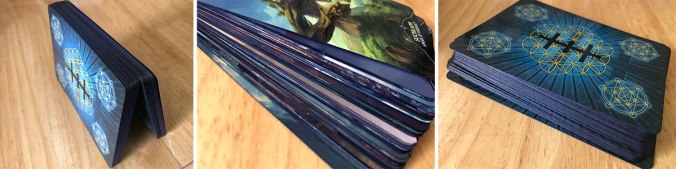
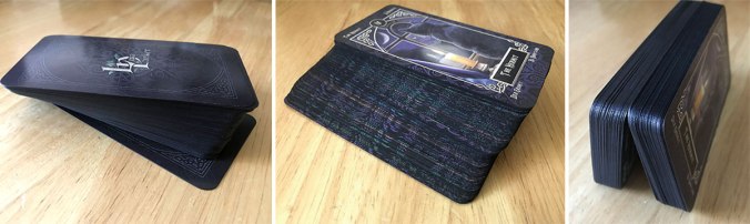
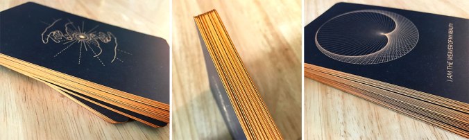
First up is the Angelarium: Oracle of Emanations deck. I’ve said before that I’m not a big fan of angel decks, but I did end up ordering this one because the angels… well, don’t look like traditional angels. I like the artwork, and I’ve actually pre-ordered the sequel (Angelarium: Oracle of Watchers) which I plan on combining with this deck to make into a single larger deck.

The only thing I did with this deck is edge it in black. Interestingly, something about the card stock made the black turn a shade of dark, dark blue which I really like. I decided to only do one coat specifically to preserve this blue hue.

Angels_Ancestors

The Angels and Ancestors is another deck with angels in it, and yet they also are not the traditional iteration of the concept.  They actually give me an impression more of spirit guides than angels, which along with the artwork and color scheme, made this deck easy for me to bond with.

For this deck, I got the idea for the edging from Boho Tarot.  I liked what she did with her deck and modified it a bit for my own tastes.   I first edged in yellow marker before using Distress Ink’s Tea Dye shade as a finger-rub along the edges for an uneven, aged look.  I then used gold ink in the same finger-rub method to give a hint of sheen.

Arcana

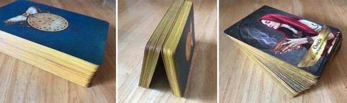
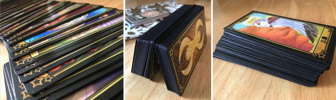
The Arcana deck by Dead On Paper.   I looked and looked for this deck for quite a while after I stumbled upon a random image of one of its major arcana cards.  I couldn’t find it and was so frustrated.  Then I saw it on BoyDiviner’s YouTube and he was kind enough to provide me with the name of the deck and publisher.  From there I immediately ended up purchasing the deck and I’m really glad I did.   The card stock is SO nice, the size is standard playing card size (as opposed to standard tarot size).   The deck is structured so that it can be used as either a tarot deck or a playing card deck.   I love it.

The cards aren’t black but actually a really deep, dark brown with a hint of distressed texture.  So, what I did was I edged them in black.   I then used the finger-rub method to add bronze marker ink to the edges.

Badgers_Forest

The Badger’s Forest Tarot was a bit of a debate for me when I first got it, to be honest.  I have absolutely no fondness for the thick brown border on the backs of the cards.  At all.   But, the deck is borderless on the face of the cards, which means if I wanted to remove the brown border, I’d have had to cut into the artwork… and I just wasn’t willing to do that.

So… I decided to live with the brown borders on the backs.  I don’t do a lot of face-down spreads, as I prefer to set my cards down face up and get my initial impressions as they are laid into place, so it’s not a huge sacrifice.

For modification,  edged the card in brown, taking a good deal of care to ensure that I didn’t pollute the artwork on the front of the cards with the ink. I then did a finger-rub with bronze marker ink.

Dreaming_Way

The Dreaming Way Tarot, I edged in a combination of greens.  This included green Midliner marker overlayed with yellow PrismaColor marker, as well as three different shades of Distress Ink (Bundled Sage, Shabby Shutters, and Old Paper).   Essentially, I shuffled the deck, and then split the deck into four equal sections and colored each section with a different shade.

Faery_Forest

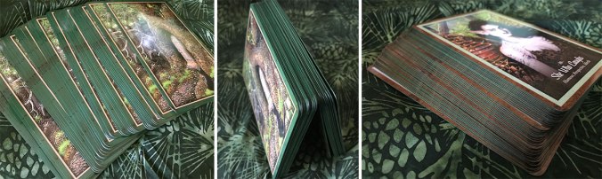
The Faery Forest Oracle is the oracle that I pair my WildWood Tarot deck with when doing intricate spreads (such as the year in view spread).  You can see the swaddle (cotton cloth) that I use to store the deck in within the background of the photos.  That fabric is the same fabric that I use to swaddle the WildWood deck. For me, the two decks just… go together.

I edged this deck in PrismaColor green marker.

WildWood

As you can see above, I also edged my WildWood Tarot in PrismaColor green marker.  I did this with intention, because like the swaddling of the Faery Forest Oracle, I wanted the colors to match each other.

Before edging this deck, I trimmed it.  The white borders on this specific deck of cards really bothered me.  It felt like the artwork and message of the cards was “trapped” inside a cage.    Freeing this deck from its borders makes it feel far more open and has made it far easier for me to read intuitively.

At the same time, I didn’t want to remove the titles, because I -do- use the guide book with this deck and sometimes need a little help identifying the cards due to their nontraditional depictions. By leaving on the titles, it made the design on the back a bit off-center.   Although this niggles at my anal-retentive side, it was the most practical option, and I can live with it.

Familiars_Tarot

The Tarot Familiars just felt unfinished.  Black backs, dark fronts… white edges.   It just didn’t jive for me.  I had initially wanted to edge the cards in colors to match the dark hues used in the borders on the fronts of the cards, but I found it impossible to find inks that were a good match, so I ended up edging the deck in black marker instead.

Godard_Bird_Spirit

Godard’s Bird Spirit Tarot (sorry, I don’t have a link for this one) is a deck that I don’t really see passed around a lot in the tarot community.  That said?  I love the deck.  I think the artwork has a sweet depth to it and the cards have vibrancy to them without being overpowering.

I simply edged this deck in black to finish it off, because like the Familiars Tarot, it felt unfinished with black borders on both the fronts and backs, but white edges that were raw and unfinished.

Kuan_Yin

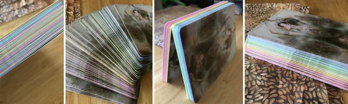
The Kuan Yin Oracle is one of the decks that I recently wrote about in Part 1 of my response to Ethony’s 31 Days of Tarot.  I really like the softness of this deck, but it felt unfinished in the way some of my other decks that I’ve edged did.   The card faces have borders in a variety of different shades, and although I considered cutting them off, I ended up using them as a guide to color the edges in matching hues.

In the picture above, you can see the hues all in order, and then on the far left you can see what the deck looks like shuffled.

Mystical_Shaman

The Mystical Shaman Oracle was given to me by you just recently for our anniversary, and you’ve already seen a few pics of the finished work, because I was doing it while we were talking.

I edged each side of this deck in a different PrismaColor marker to match shades of color off the card backs (green, yellow, red, brown).   Once edged in marker, I then applied bronze Sharpie ink with the finger-rub method before repeating the process with Distress Ink in black in a fade from the corners.

Oracle_Echoes

The Oracle of Echoes came into my collection recently and also felt unfinished with the plain white edges.   This deck also comes with a PDF “little white book” rather than a printed one.  I ended up printing out the PDF and making it into a book.  I might make a post about that later at some point, as it was my first experience in making a book.

I debated between whether I wanted to edge this deck in black, or edge it in red and then antique it with black ink.   I ended up going with edging it in black because I felt the deck’s artwork (back and front) was busy enough and that the red might end up distracting from the artwork.

Pagan_Otherworlds

This is turning out to be a monster post, yeah?

Next is the Pagan Otherwords Tarot.  This one, you can barely tell the edging even in person.   I edged the deck in the gold colored Brilliance DewDrop, but I kind of feel like it’s too light or… not opaque enough.

I might end up trying again with a gold Sharpie.  I would really like to get to a shade and texture of colors that better matches the antiqued gold look on the inside of the box.

Sacred_Geometry01

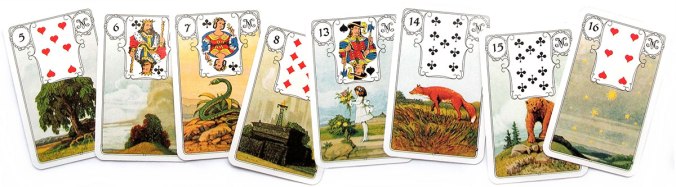
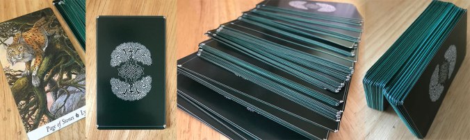
Maria Rikteryte’s Sacred Geometry Cards are a deck that I really debated on whether I wanted to trim or not.   I originally bought these with the intention to do just that.   I bought them to combine with the Cosmic Cards deck by Amaya Ajay, which would have involved trimming this deck to match the size of the Cosmic Cards.

Sacred_Geometry02The problem was… these cards are really huge.  I mean REALLY huge. (I’ve included a picture of one of the cards set beside a standard tarot sized card so that you can see what I mean.)  They’re bigger than I thought they would be, even though I looked at the size before buying them.   Trimming them down to match the size of the Cosmic Cards wasn’t feasible.   Trimmed vertically, you would end up with a few cards with the phrases truncated on either side.  Trimmed horizontally, you have to sever the designs exactly in half.

So… I decided to keep them their original size.  At least for now.   And I edged them in orange Midliner marker followed by yellow PrismaColor marker in order to match the shade of orange in the designs on the cards.

Secret_Forest

For the Tarot of the Secret Forest, I did another edging in black.   Sometimes?  That’s all that’s needed to make a deck feel finished.   In this case, that was especially true.  Both the backs and the fronts of these cards contain artwork, and both the backs and fronts have black borders.  The white on the edges just didn’t look good at all, whereas in my opinion the deck now looks really nice.

Student5

Another deck that I just edged in black was the Student Tarot (I believe this is v.5).  I don’t have a link for this one either, unfortunately. This is another deck you don’t see very often in the tarot community.   It was a gift from my sister and is… well, cute as fuck.   It’s designed with little anime characters  on the cards and always has a very “cheerful and fun” energy whenever I use it.

Vintage_Oracle_Tarot

Third in a row!   Another black edging.  This is the Vintage Oracle Tarot.  As you can see, like the Tarot of the Secret Forest, it has a nice thick black border.  The white on the edge of the cards really bugs me on cards with black borders and edging the deck in black in those cases always seems to create a sense of relief… as if the white causes some sort of stress that edging them in black eases.

White_Sage

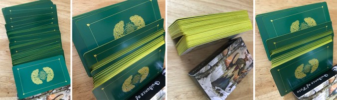
This is the White Sage Tarot, which as you can see, I edged in multiple colors.   The reason for this was because this deck has a clear intention to it as to being used with Chakras energy.   The information for Chakra associations is very clearly outlined in additional cards included in the deck as well as in the little white book, where the author specifies which Chakra each card is associated with.    I divided the deck into the seven chakras as per their associations in the little white book, and then used Crayola permanent marker on the edges to correspond with the Chakra colors. I then used the Brilliance DewDrop in platinum to add a bit of a finger-rub of sheen to the cards and “cool off” the colors a bit.

The last picture on the right shows how this deck looks after being shuffled.

I initially wanted to add a little colored dot to each card instead, and leave the edges white, but the card stock is so glossy that I couldn’t get any of my markers to stick.  The marks just rubbed right off, even after letting them dry for a bit.

WildWood_Mini

This is my Mini WildWood Tarot, which I’m pretty sure is an unauthorized publication out of China?   I’m not entirely sure where I got this deck, as I have had it for a really long time.  If I’m not mistaken, it was a gift.  I could be wrong on that.

Anyway.   I edged this deck in yellow PrismaColor marker to match the yellow on the back of the cards.  I considered doing it in green, as I had for my full sized WildWood mentioned above, but I didn’t want it to be a clone as the mini deck has it’s own energy and personality.

Wisdom_Seekers

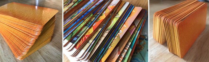
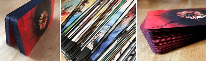
Last, but certainly not least, is the Wisdom Seeker’s Tarot.   It’s funny, because I’ve noticed that people either seem to love the backs of these cards, or really dislike them.  There doesn’t seem to be any middle ground there.

I personally like them, which is a bit surprising, because I’m not really a big fan of “hot” colors (reds, oranges, yellows).   But for this deck?  The backs seem just right.

I trimmed this deck to remove the white borders that were present on both the fronts and the backs.  They just felt so wrong.  So…. I cut them off, although I ended up leaving the titles mostly because I’m a fan of precision.  Reading from a deck without the titles is a very intuitive process for me.  Sort of the difference between spilling ink over paper to create art, or instead using a pen nib to draw with.   The titles are the nib.  I may spill ink too, but I like having the pen handy.

After trimming, I edged this deck with orange PrismaColor marker on the horizontal edges, and yellow PrismaColor marker on the vertical edges.  I then used the Brilliance DewDrop in gold to do a finger rub that was heavier on the corners and lighter along the planes, causing the orange and yellow to blend a bit rather than being so stark in transition.

I’ll probably let another handful of modifications build up again before I do another post like this.  It just feels easier for me to post them in a group like this than to share them individually.

Deck Modification – The Star Tarot

001

I posted a little while about deck modifications and my plan to start with the Blue Messiah deck.   My plans changed a bit when I got my hands on this one, though and I decided to start with The Star Tarot by Cathy McClealland instead.

The first thing I did was get out my mini guillotine cutter and my corner rounder.  I then resized one of the cards (the King of Swords), working a little at a time to cut the card down until I found a size that was comfortable and yet wasn’t cutting off the titles.  Although this tarot deck would be easy to read without the titles, I really didn’t -want- to lose them.  I might change my mind sometime in the future, but for now I’d rather they stay.

Once I found the size I wanted, began cutting down cards, one at a time.  I did all of the tops and bottoms first, and compared each to the King of Swords to ensure they were uniform size, then went back and did the sides second, repeating the comparison with the King of Swords with each card.   I then rounded the corners using my corner punch.

002

Half way through the deck, I took a pause to take a few pictures for a size comparison between the original size of the cards, and the cropped size.

I’m not entirely pleased with my corner punch at this point.   On a card without a clear coat, the punch I’m using cuts nice and clean.   These cards, though, have a sort of clear laminate type of coating on them, and I’ve noticed that my corner cutter appears to have a little trouble with that coating.  Some of the corners ended up a little… not ragged or uneven, but with tiny tags of uncut laminate slivers.   It’s probably not something I’d have noticed if I hadn’t decided to also edge the cards.

I’m not a huge fan of that type of laminate on the cards, either, incidentally.  It makes the cards feel almost “sticky” when shuffling.  It was the reason I chose this deck to start with, actually.  Between the size and the stickiness, I figured I would never used this deck unless I could make it more user friendly.

So the next step is the inking of the edges.

003

I used Distressed Ink for the edging, starting with stamping the edges using Seedless Preserves (purple) for an uneven finish around the edge of each card.  This left a bit of white exposed in places.  I then used Salty Ocean (blue) in a rub around the edges and over the purple.

Above, I’ve posted a photo of the deck half done with cards set out to dry between stamping.  I left the cards to dry for thirty minutes between each application of ink, and rubbed the edges with a rag after the wait was over each time to remove any excess.

The application of the darker ink (purple) done unevenly followed by the lighter (blue) ink afterward created a mottled deep blue effect that I think matches the card’s border and back really well.

004

I did take about twenty cards out and use the purple in a second sweep on top of the blue, darkening the color as a result, which once shuffled into the finished deck, resulted in a darker blue than the original results.

I then let the deck sit out for 24 hours to ensure that the ink had fully dried on all of the cards.

I’m really happy with the end result of this modification.  I think the deck looks much better, and the size is much easier to handle.  The only thing I’m not a fan of is the laminate coating that I mentioned earlier.  I’m hoping that with a good amount of use, that it’ll lose some of its stickiness.   The one thing I was worried about with resizing the deck is that I’d damage whatever shuffle-ability they had.  But, I managed to get the sizing uniform enough that it isn’t an issue.

005

The last pictures in this post are of the finished deck and the “swaddle” that I chose to home the deck in.

This deck came with a huge box (and a book).   I don’t keep boxes when they are oversized, so I have a variety of decks that are wrapped in a “swaddle” of 100% cotton in place of a box.   For this deck, I found a fat quarter that I feel fits the deck perfectly.  Not just in color, but in the design of the print as well because, to me, it looks like the night sky.